Ui Design
Interface design and design systems for scalable digital products.
Figma
Component Library
Rebrand
Scentsy Design System
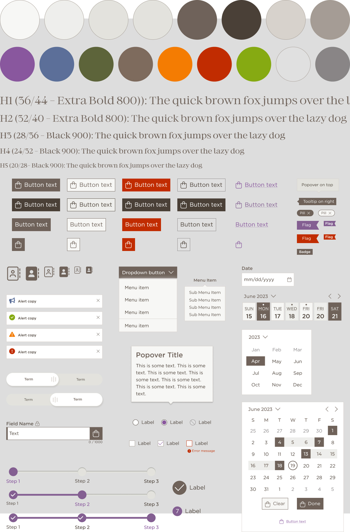
Context: Scentsy's major rebrand in 2025 meant carrying a new visual direction across an already complex and established Figma Team Library. The full style guide required updating across colors, typography, elements, buttons and inputs, and the library had to stay functional and reliable for the team throughout the transition.Approach: I maintained and evolved the library through that process, collaborating with UX designers to refine components along the way. I used generative AI as a reference tool to help define naming conventions, token structures and responsive text scale, and to troubleshoot structural issues in older components that needed updates like auto layout applied correctly. To manage responsive text more efficiently, I built out variable collections that could be applied consistently without manual updates for desktop and mobile breakpoints.
Outcome: The library absorbed the rebrand without disrupting the team's workflow. Components stayed scalable and the foundation was solid enough to keep building on.
Design Systems
Iconography
Figma
Icon Component
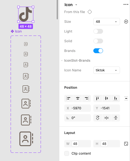
Context: The icon system needed a full rebuild to align with the rebrand. The existing library was all custom icons, but a lot of them were standard UI elements: chevrons, shopping cart, user, plus, minus. Redesigning those from scratch didn't make sense when Font Awesome icon kits were already part of the paid plan. There was also a practical concern: Font Awesome doesn't support replacing icon images, so rebuilding the existing library risked duplications and unicode reference issues for developers.
Approach: Pulling from Font Awesome for the standard icons was the cleaner solution. I set up sizing on a 4px scale using variables and added support for Classic Light, Solid and Brands styles. A new button component followed, built on Figma variables and integrated with the new icon component, with boolean toggles for independent text and icon control.
Outcome: Because the component pulled from Font Awesome kits, adding or removing icons as needs changed required no design effort and left no wasted work behind. That freed up focus for custom icons that needed to be Scentsy-specific, reducing design debt and making the library easier to maintain over time.
UI Design
Mobile App
Marketing Assets
Scentsy Connect Mobile App
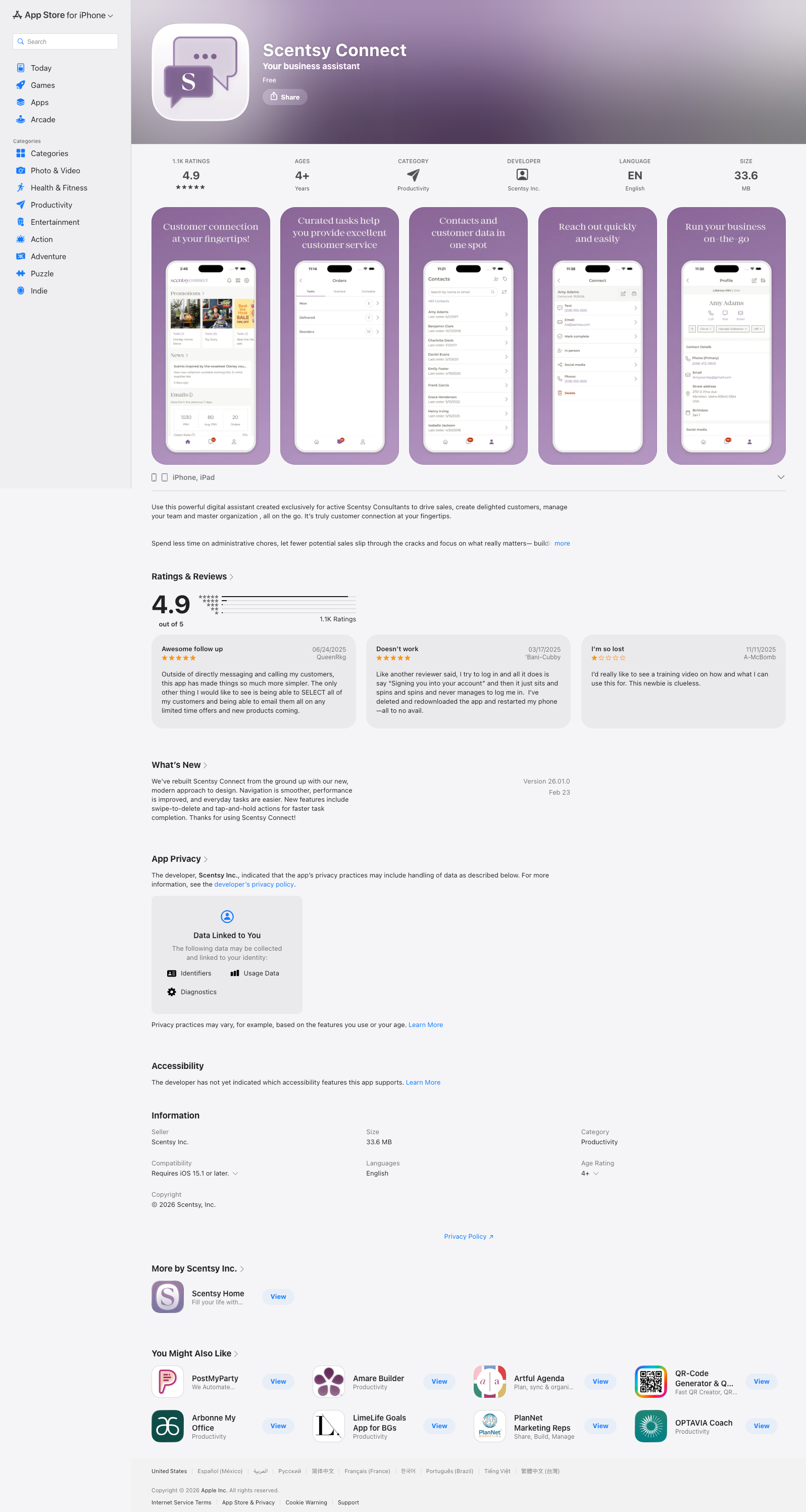
Context: Scentsy Connect is a mobile app built for Scentsy's consultant network. The UI needs were distinct from standard web contexts, requiring careful thought about how the design system translated to a smaller, more task-focused experience.
Approach: I collaborated with the UX designer on the app logo, provided UI design finessing, designed the app store presentation slides for Apple Store and Google Play, and created marketing assets the consultant network could use to drive downloads and engagement.
Outcome: The app launched with a cohesive visual presence across the product itself, the app stores and the marketing materials supporting it.
View in the App Store and Google Play:

App Store

Google Play
Explore more work
©2026 Darcy Hinrichs Design. All rights reserved.

Built with Figma Sites & a little vibe coding.
Ui Design
Interface design and design systems for scalable digital products.
Figma
Component Library
Rebrand
Scentsy Design System
Context: Scentsy's major rebrand in 2025 meant carrying a new visual direction across an already complex and established Figma Team Library. The full style guide required updating across colors, typography, elements, buttons and inputs, and the library had to stay functional and reliable for the team throughout the transition.Approach: I maintained and evolved the library through that process, collaborating with UX designers to refine components along the way. I used generative AI as a reference tool to help define naming conventions, token structures and responsive text scale, and to troubleshoot structural issues in older components that needed updates like auto layout applied correctly. To manage responsive text more efficiently, I built out variable collections that could be applied consistently without manual updates for desktop and mobile breakpoints.
Outcome: The library absorbed the rebrand without disrupting the team's workflow. Components stayed scalable and the foundation was solid enough to keep building on.
Design Systems
Iconography
Figma
Icon Component
Context: The icon system needed a full rebuild to align with the rebrand. The existing library was all custom icons, but a lot of them were standard UI elements: chevrons, shopping cart, user, plus, minus. Redesigning those from scratch didn't make sense when Font Awesome icon kits were already part of the paid plan. There was also a practical concern: Font Awesome doesn't support replacing icon images, so rebuilding the existing library risked duplications and unicode reference issues for developers.
Approach: Pulling from Font Awesome for the standard icons was the cleaner solution. I set up sizing on a 4px scale using variables and added support for Classic Light, Solid and Brands styles. A new button component followed, built on Figma variables and integrated with the new icon component, with boolean toggles for independent text and icon control.
Outcome: Because the component pulled from Font Awesome kits, adding or removing icons as needs changed required no design effort and left no wasted work behind. That freed up focus for custom icons that needed to be Scentsy-specific, reducing design debt and making the library easier to maintain over time.
UI Design
Mobile App
Marketing Assets
Scentsy Connect Mobile App
Context: Scentsy Connect is a mobile app built for Scentsy's consultant network. The UI needs were distinct from standard web contexts, requiring careful thought about how the design system translated to a smaller, more task-focused experience.
Approach: I collaborated with the UX designer on the app logo, provided UI design finessing, designed the app store presentation slides for Apple Store and Google Play, and created marketing assets the consultant network could use to drive downloads and engagement.
Outcome: The app launched with a cohesive visual presence across the product itself, the app stores and the marketing materials supporting it.
View in the App Store and Google Play:
App Store
Google Play
Explore more work
©2026 Darcy Hinrichs Design. All rights reserved.
|